
|
A square box, in which an "X" appears when selected. The Check Box offers a way to present a variety of options. Each Check Box has its own specific information. Variable, Value and Text are all different, allowing the user to select more than one. Any number may be marked or left unmarked. A Check Box can have a value of 0 (unchecked) or 1 (checked). Each checkbox in a dialog should use a unique Variable. The Check Box control will return the user’s selection in the variable you supply as the Variable attribute in the control’s definition. The value 1 indicates the control was checked, and 0 indicates the control was not checked. Normally, when a dialog box opens, every checkbox defaults to being unchecked. You can change this by assigning a value of 1 to the variable before calling the Dialog function.
|
|
For example, the line in the script generated by the WIL Dialog Editor may look like:
Monster003=`079,023,064,014,CHECKBOX,"CheckBox_1",flesh,"Green Skin",1,3,DEFAULT,DEFAULT,DEFAULT,DEFAULT`
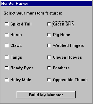
The following example generates this dialog:
