|
The Menu Editor dialog allows you to add a menu bar and menu items to your dialog template.
The WIL Dialog Menu Editor can be launched in one of two ways:
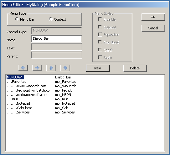
The following explains the meaning and operation of each control in the Menu Editor dialog. Menu Type The two Menu Type radio buttons allow you to choose between editing the menus associated with the menu bar and the menus associated with your dialogs default context menu.
Note: The Menu Type group is enabled only for editing your main dialogs menus. Since controls only have a context menu, this group is not enabled. Type This read-only text indicates the control type of the currently selected menu control. It can display either MENUBAR or a MENUITEM. Name This control is used to display and edit the control name attribute associated with the currently selected menu bar or menu item. The name is used to set the hierarchical relationship between menus and submenus. It is also used as the third parameter to your user-defined callback procedure on menu selection when you are processing menu events in your callback. Text This is the caption displayed by a menu item menu when its associated menu is displayed. You can add an access key for the menu item by placing an ampersand (&) immediately before the character in the caption. The access key will cause the menu item's selection while its hosting menu is visible. This attribute can also be used to associate a short-cut key with the menu item. This is done by appending a single backslash (\) to the caption followed by a key sequence. Use the key representations established for the SendKey function. The key sequence will automatically be converted to the system's current key representations when it is displayed next to the menu's caption in your dialog. Unlike an access key, a user can select a menu item using a hot-key combination even when the menu item and its menu are not displayed. Note: Short-cut key combination should not be used with menu items that display dropdown menus or submenus. It is not considered good UI design and the menu caption may not display correctly. Parent The name of the selected menu item's parent or host is displayed here. The Parent name can be the name attribute for a regular control, the menu bar, another menu item, or the DEFAULT key word when the menu item is a top level menu item of your dialog's context menu. The arrow buttons are used to change a menu items Parent attribute. Menu Styles The check boxes in this group set the menu styles for the currently selected menu item.
Note: if both the check and radio style are selected, the check style will take precedence. Left Arrow Press this button to decrease the menu level of the currently selected menu. When the menu level is decreased the menu item may because a part of a different menu in the hierarchy. A change to the menu's relative position in the menu hierarchy will cause a change in the menu item's Parent name attribute. Right Arrow Use this button to increase the menu level of the selected menu item. Increasing the menu level can cause the selected menu item to be the start of a new submenu or dropdown menu. Any change to the menu's relative position in the menu hierarchy will be reflected in the menu item's Parent name attribute. Up Arrow You can move the selected menu item up in the display order with this button. Depending on the menu items current level and the level of surrounding menu items, moving a menu item up can also cause a change in the menu items menu membership. Any change in menu membership is reflected in the Parent name attribute and the position change is reflected in the Position attribute. Down Arrow This arrow button moves the selected menu item down in the display order. When a menu item is moved it can cause both a change in the Position attribute and a change in the Parent name attribute. A change to the Parent name attribute also changes the menu that displays the menu item. New This button creates a new menu item or the menu bar in the menu list. If a menu item is already selected, the new menu item will have the same menu level as the selected item. It will also be position just below the selected menu item. If the Menu Bar radio button is selected and the dialog does not already have a menu bar, a menu bar is created the first time this button is pressed. Delete Press this button to remove the selected menu item from menu item list. If the menu bar is selected the entire menu hierarchy is deleted. Deleted items are not removed from your dialog's template until either the Menu Type radio button selection is changed or the OK button is pressed. Menu List View The Menu List View is a two column list representing the menu bar and its menu items or the menu items of a context menu. The first column shows a menu item's caption and the second column shows the name of a menu item or the menu bar. Selecting an item from the list allows you to edit the attributes for that menu control. The indentation level of the menu item in the Menu List View determines whether the menu item causes a menu command event or causes another menu to be displayed.
OK Choose this button to verify and save changes to your dialog template before exiting the Menu Editor dialog. Cancel Choose this button to exit the Menu Editor dialog without saving changes.
|
WIL Dialog - Dialog Attributes
|