|
Attributes… Selecting the dialog or one of its controls enables this menu item. The Attributes property dialog allows you to set the values that define your dialog and the controls it contains. The information you entered in this dialog becomes the comma-delimited list of values for each control variable and other template variables that define your dialog. You will see from two to four tabs when you launch this dialog. The tabs you see depend on the attributes of the visual object that is selected when the Attributes Dialog is launched. The contents of each tab of the Attributes Dialog also vary depending on the attributes of the selected object.
The WIL Dialogs Attributes Dialog can be launched in one of two ways:
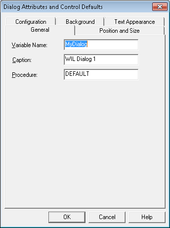
General Tab The general tab can contain one or more of the following edit boxes:
Name The control's name is used to identify the control in a user-defined-callback procedure. A control's name cannot contain more than thirty characters and must be unique. The name will be used as the third parameter to the UDF when a control related event triggers call. It is also used to identify the control when calling any dialog callback related functions requiring a control name.
Tab Order This edit box controls the order of the control definitions in your dialog template. For example, if you give a control the tab order value of "1", it will be the first control listed in the dialog template. This position is important because it determines the tab order of the controls in your dialog and the tab order determines the sequence in which the controls are selected when a user presses the TAB key to move through the dialog.
The Tab Order also affects the appearance of your dialog, if you have overlapping controls. When two or more controls overlap, the control with the smallest Tab Order number will hide the overlapping portion of any control with a bigger Tab Order number. Tabs in Group Box control: The Group Box control owns all of the controls inside of it and tends to use the tab order of the Group Box. Its best to first set the tab order on each Group Box and the controls that do not live in a Group Box. Then set the tab order within each Group Box.
Variable Name Type the name of a WIL variable in the Variable Name edit box. Values assigned to this variable will be used to set the displayed value(s) or initial state of the control. The variable can also contain selection or state information after the dialog is dismissed. This variable can be shared by more than one control when it makes sense to do so. It can also be used in WIL scripts, like any other WIL variable, so it must conform to WIL identifier rules.
Text A control displays the text entered in this edit box.
Value This value is the number returned by the WIL dialog function when the user presses the button control to close your dialog. For this reason each Push or Picture button in your dialog template must have a unique value. The value of a selected Radio Button is placed in the Variable associated with a group of Radio Button controls. You should, therefore, assign a unique value to each Radio Button that shares a common Variable.
Caption Enter the title of your template dialog here. The title appears on the bar at the top of your dialog.
Pre-selected Item Use the Pre-selected Item edit box to enter a default selection for controls that can display multiple values. When a dialog is dismissed, the pre-selected item will be placed in a controls variable, if the user has not selected an item.
Procedure Place the name of your User-Defined-Callback procedure in this edit box. See the discussion of the User-Defined-Callback procedure in the dialog function, in the WIL reference, for more information. You do not need to supply a value, if you do not wish to use a User-Defined-Callback procedure.
License String For a COMCONTROL control that requires a license, the quoted license string should be placed here. Use the DEFAULT keyword as a placeholder if the control does not require a license.
ProgID/ClassID/URL ProgID is used with COMCONTROL controls and is the programmatic identifier of an ActiveX , OLE or COM component control that supports integration into an automation client container. It is usually in the form servername.classname. ClassID can be used as alternative to a controls ProgID. It is a sequence of hexadecimal numbers that must be quoted and enclosed in a curly brace ({}) pair. It is usually in the form "{XXXXXXXX-XXXX-XXXX-XXXX-XXXXXXXXXXXX}" where each X is a hexadecimal digit. URL : There are special monikers that can be used in this attribute to implicitly use the WebBrowser control or MSHTML COM component provided by Internet Explorer. You can use the WebBrowser control by placing a quoted URL moniker recognized by Internet Explorer in the attribute. The URL can point to either a local file or a document on the Internet. Use the Document control by specifying the programmatic identifier "MSHTML:" in this attribute. You can optionally add valid html text after the colon (:) and the MSHTML document object will parse and render the html in its window.
Delimited File For a REPORTVIEW control, to set to the path and file name of a CSV file used to populate the control. The file must meet the same CSV file requirements specified for the ArrayFileGetCsv function and the value separator must be a comma(,). The first line of the file can optionally contain column headings. See the Style attribute for details.
Format (dMyhHmdt'') The text attribute is used to indicate the date/time format the control displays. Specifying 'DEFAULT' or using an empty string causes the control to use the current system default date format. The following table lists the standard Windows date/time format characters accepted and interpreted by the control. Non-format characters are accepted but they must be enclosed in single (') quotes.
Style Tab Use the Style Tab to choose the styles for your control. This Tab only displays styles that are applicable to the selected control. Check any style you wish the control to have.
Invisible Check this style and the control will not initially be visible in the dialog.
Disabled When this style is selected the controls appearance will change to indicate that it can not receive user input.
Center Text This style causes a VARYTEXT or STATICTEXT control to display text centered horizontally in the control's rectangle. This style can not be used with the Right Align Text style.
Right Align Text A VARYTEXT or STATICTEXT with this style displays text flush-right in the control’s rectangle. This style cannot be used with the Center Text style.
Numbers Only Check this style for an EDITBOX and MULTILINEBOX and the control will only accept digits. Note that, even with this set, it is still possible to paste non-digits into the control.
Read Only This style prevents a user from changing a control’s text by typing new or editing existing characters. Although this style can be applied to SPINNER controls, The user can still change the value displayed by using the control’s up and down arrows.
Password Check this style and an EDITBOX control will displays all characters as an asterisk (*) as they are typed into the control.
List Only A DROPLISTBOX control will only accept values already in the drop down list portion of the control when this style is checked.
Default Button A PUSHBUTTONs or PICTUREBUTTONs with this style is the default button when no other button has the input focus. Because it is the default, your dialog user can select this button by pressing the enter key, if no button has the input focus. You should only give one button this style. If this style is checked for more than one button, only the first button (in the tab order) will have the style. Generally, apply this style to the button that is the most likely option in your dialog.
Flat Appearance A PUSHBUTTONs or PICTUREBUTTONs with this style, creates a button with a flat appearance. All aspects of the button's border are removed including the 3D shadowing.
No Auto Height Resizing A FILELISTBOX or ITEMBOX with this style, turns off automatic height adjustment feature. Normally, these controls adjust their height so that they do not display partial items.
Security Shield Icon (Vista or Newer) Select this style to display the Security Shield icon on the left side of a PUSHBUTTON or PICTUREBUTTON control. Use the Shield icon to indicate that pressing the button will result in a request for security elevation before processing the button’s associated command. This style only affects systems running the Vista version of Windows. Dialog Editor and the Dialog function accept the style but do not display the icon on pre-Vista systems.
On Focus No Selection, Cursor at Beginning Select this style to place the cursor at the beginning of any text in the EDITBOX control.
On Focus No Selection, Cursor at End Select this style to place the cursor at the end of any text in the EDITBOX control.
No Column Headers REPORTVIEW control, the header bar is not displayed across the top of the control.
First Row Column Header Text REPORTVIEW control, the first row of the source array or file is treated as column header text.
Display Grid Lines REPORTVIEW control displays vertical and horizontal lines to form a grid.
Single Row Selection Only REPORTVIEW control, only one row can be selected at a time.
Selection Highlighting Extends to All Columns REPORTVIEW control, selection highlighting extends to all subitems in the selected row.
Sort Ascending REPORTVIEW control is populated with rows ordered from lowest to highest first column values. Sorts using an "intuitive" sort (See ArraySort for details). The user can reorder control rows based on any column's values by clicking on the column header.
Sort Descending REPORTVIEW control is populated with rows ordered from highest to lowest first column values. Sorts using an "intuitive" sort (See ArraySort for details) The user can reorder control rows based on any column's values by clicking on the column header. Note: if both sort ascending and descending are used, sort ascending takes precedence.
Allow Primary Item Edits REPORTVIEW control, the first column text can be edited in place.
Display Checkbox(es) For REPORTVIEW control, enables check boxes for each first column item in the control. For DATETIME control, adds a check box that indicates no date/time value when unchecked.
Return Column Headers REPORTVIEW control, the column header text is added as the first row of the array returned from an item search request, a selected or checked item request, or a request for all items of the control. This style will also cause the control's associated variable to contain the column header text as the first row of the array referenced by the variable.
Use a Spinner Instead of a Drop-down DATETIME control, replaces the controls drop down calendar with a spinner. The spinner can be used to change the value of individual elements of the displayed date/time.
Position and Size Tab The Position and Size Tab is used to control the location and aspects of the size of your dialog on the screen.
Add DPI Variable for Automatic Adjustment Check this box to have the editor generate a "DPI" variable to the dialog's template. When this variable is present in the template, the dialog will adjust sizes to the scaling of the system displaying the dialog.
X Position Use this box to specify the location of your dialog’s upper left hand corner along the horizontal axis. This value is expressed in dialog units. Y Position Use this box to specify the location of your dialog’s upper left hand corner along the vertical axis. This value is expressed in dialog units.
Use the Current Screen Location Press this button to set the location of your dialog’s upper left hand corner to its current position on the screen. If the current values of X Position and Y Position correspond to the current screen position, pressing the button has no affect.
Use Sizing Dialog Borders Check this box to allow the user to resize the dialog.
Minimum Width Indicates the approximate minimum width of the dialog window that can be set by the user dragging the dialog's borders. The values are assumed to be in dialog units. When this variable is defined in a dialog template, the dialog becomes re-sizable by either directly dragging the dialog's border or by using the 'Size' system menu. Minimum Height Indicates the approximate minimum height of the dialog window that can be set by the user dragging the dialog's borders. The values are assumed to be in dialog units and to not include the height of the title and menu bars. When this variable is defined in a dialog template, the dialog becomes re-sizable by either directly dragging the dialog's border or by using the 'Size' system menu.
Configuration Tab The Configuration Tab allows you to control how the Dialog Editor creates the Dialog statement.
Use the default return variable name Select this option and Dialog Editor will use Pushbutton as the name of the Dialog statement’s return variable.
Use a unique return variable name If you select this option, Dialog Editor will prefix the name of the Dialog statement’s return variable with the name of the dialog. For example, if your dialog is named mydialog, the return variable will be named mydialogpushbutton.
Create a dialog function that WinBatch will process Select this option and the Dialog Editor will create a Dialog command with the second parameter set to one (1). This tells WinBatch to process the Dialog command by loading the dialog template listed in the commands first parameter.
Create a dialog function that WinBatch will ignore Use this option to have the Dialog Editor create a Dialog command with the second parameter set to zero (0). When the second parameter is zero WinBatch will ignore the command by neither loading nor displaying your template and continuing to the next statement in your script.
Background Tab Use the Background Tab to set your preferences for a control’s or dialog’s background color or background bitmap.
Use Default Background Check this box if you want your control or dialog to display the system default background. The system default background depends on the type of control and the system settings. For some controls the default background is transparent so that the underlying dialog background becomes the controls background.
Background Color This edit box is used to indicate the background color of a control. Color is expressed as three vertical bar (|) delimited numbers representing red, green and blue. Valid red, green, and blue values range from 0 through 255, with 0 indicating minimum intensity and 255 indicating maximum intensity. Controls that support background color do not support bitmap background. This button launches the color selection dialog. Use the dialog to select one of the preset colors or press the Define Custom Color button to create your own color. When you press the Add to Custom Color button, the Dialog Editor will remember the color the next time you use the color selection dialog. If you select a predefined or custom color with a mouse click, the RBG values will be placed in the Background Color edit box for you.
Bitmap File Use this edit box to enter the name and path of a Bitmap file. The bitmap will become the background image for your control or dialog. Colors that support bitmaps do not support solid background colors directly. It is possible, however, to create the same affect by specifying a solid color bitmap for the control. This button launches a file selection dialog. You can use this dialog to navigate your local file system or network to find a bitmap file. When you select a file and press the ok button, the complete bitmap path and file name will appear in the Bitmap File edit box.
Text Appearance Tab Use this tab to control the font and color of a control’s text.
Use Default Font and Color Check this button if you want your control to use the current system font and text color or the dialog font or text color. A control will use the system font and color when the dialog text appearance is defaulted, otherwise, a defaulted control will use the system font and color.
Font and Color Selector… Press this button to display the font and text color selector. The selector dialog allows you to view examples of and select available fonts and colors. When you press the selector’s OK button, your selections will be placed in the font and text color edit boxes. Note: When you press the OK button, the selection dialog will replace the DEFAULT setting with a specific font and text color. If you do not wish to have specific values for both font and color, simple replace the unwanted value by typing the DEFAULT key word in the appropriate edit box.
Font This edit box contains four bar delimited (|) fields that describe the font used to render text in a control. Although it is possible to manually construct a font description, it is recommended that you select your font with the Font and Color Selector dialog and let Dialog Editor create the description for you. If this attribute is set to DEFAULT, the control with use your Dialog’s font or the system font for that control when your dialog does have a font.
Text Color This edit box is used to indicate the text color of a control. Text color is expressed as three vertical bar (|) delimited numbers representing red, green and blue. Valid red, green, and blue values range from 0 through 255, with 0 indicating minimum intensity and 255 indicating maximum intensity. When this attribute is set to DEFAULT either the system text color or your dialog’s text color will be used. |
|